
The Importance of Brand Identity & Logo Design for Websites
Your logo is the first thing your website says!
Your logo is the face of your business. It shows up on your website, your packaging, your invoices, your social profiles, and every other public touchpoint you have; it always does the same job, telling people who you are before they've read a word about you. When those touchpoints share a cohesive visual language, that consistency reads as care, and care reads as trustworthy and professional. When the mark is generic, built on the same cliché imagery everyone else in the industry uses, that reads too, and it isn't flattering.
A good mark has to fit the business and the customer it's talking to. It should be iconic and timeless, visually representative of what you do and what you value, and it should hold up everywhere it lands, from a full width website header down to a 16 pixel favicon in a browser tab. Somebody should be able to see it at any size, in any context, and know instantly who you are.
That's a tall order for a small piece of artwork, and it's why a mark almost never arrives finished. It gets there through an iterative process, and that work belongs at the front of any website project, because everything built after it inherits those decisions.
Your Brand Is Bigger Than Your Visual Identity
Two things get used interchangeably that shouldn't be. Brand identity design covers the mark, the colors, the type. Your brand is the whole impression people form about your company: how you answer the phone, how fast you follow up, whether what you sold them held up. The identity can't fake that, but it can influence the initial perceptions of your brand.
That's why consistency matters. When your Instagram, your website, and a printed piece all carry a consistent and recognizable visual identity, that reads as professionalism without you saying a word.
There's a practical side too. A website needs a pile of decisions made before you can design a single section. Primary color, accent color, what typeface carries headings and what carries body copy, how the mark sits in a header and what happens to it on mobile. When those answers already exist as a system, the design has a foundation. When they don't, they get made on the fly, one section at a time, and it shows.
A Visual Identity Is More Than a Logo, It's a Design System
The logo is the centerpiece, but a real identity system is a set of tools, and every one of them ends up in the website build.
You need the primary logo lockup, and you need the versions that solve the situations the primary can't. A single icon or monogram for a favicon and a social avatar. A version that works on a dark background and one that works on light. A one color version for the times you get exactly one color. You need an alternate version for every use case you're likely to run into.
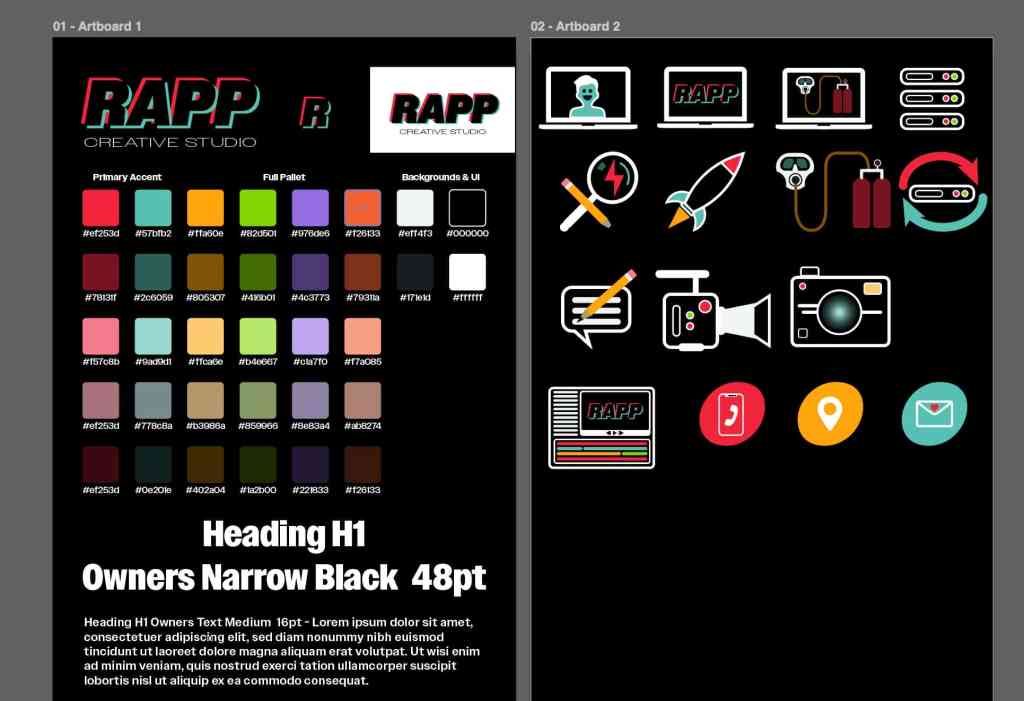
Then there's the color palette. Not just the colors in the logo, but the full working set, with the background tones, the accent colors, and the lighter and darker shades of each one. Any custom icons, illustrations, or graphic elements the site needs get built as vector artwork in that same palette, so they belong to the identity the same way the logo does.
Type gets the same treatment. Which family you're using, which weights and widths are in play, what carries display and what carries body copy at a size people can actually read. Whether that's one family or two, it should be an intentional decision that aligns with the vibe of the brand, not whatever the browser defaults to.
Get all of that decided and documented and the website has a practical starting point. Design decisions stop being arbitrary because they're all deriving from the same source.
Logo Design Process: Concept, Iteration, and Knowing When It's Done
Inspiration is real. Sometimes the concept arrives in a spark, the story the mark should tell about the business, and the visual follows from there. That part is a lightning bolt. Other times there's no spark at all, and the idea has to be worked out the hard way, through a stack of directions that don't go anywhere before one finally does.
Either way, the initial inspiration doesn't make a finished logo.
A raw idea, executed once and called done, almost always lands flat. The concept might be strong but the proportions are wrong, the weight is off, the spacing is fighting itself, it falls apart at small sizes, or it just doesn't have the presence it needs. Getting from a good idea to a finished mark takes a process: build a version, look at it, decide whether it's closer to the concept or further from it, change one thing, look again. Repeat that enough times and you eventually hit a version where you stop wanting to change anything. Not because you're tired of it, but because it's finally standing on its own.
Designing the Rapp Creative Studio Logo
I just went through this with my own brand, so it's the example I can be most honest about.
Rapp Creative Studio needed an identity fully separate from Henri Rapp Recording, my production sound business. Same person behind both, but serving completely different clients, and the new brand had to stand on its own.
A wordmark was the answer early. No icon, no mascot, no clever little symbol standing in for the work. Just the name, handled well enough that it doesn't need help. That's a harder thing to pull off, and it sets a tone.

Building the Wordmark Around Chromatic Aberration
The concept had to carry the same tension the studio was built around. Creativity structured by strategy. Right brain against left brain. Web design and video production are both screen based, so the visual language had to come from there.
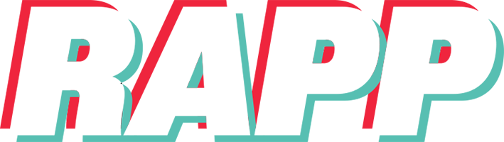
Chromatic aberration, the red and blue fringing you get in lenses and RGB screen media, is native to all of it. So the mark is built from that. Red and teal offset in opposite directions against a dark background, with the word RAPP only becoming readable in the space where the two layers meet. Neither layer gives you the full picture alone. The word exists in the overlap, which is exactly where the work happens.
The aberration frames the structure of the wordmark instead of relying on the letters themselves, which puts the duality into how the thing is built rather than what it depicts.
Iterative Design Process
The concept was the fast part. Everything after it was rounds of refinement and iteration.
The typeface is Owners. I tested other options first, and once I landed on the family I still had to work through widths and weights before it felt right. The wordmark is set heavy and italic, then stretched vertically so it stops reading as a font and starts reading as a mark. The offset distance between the red and teal layers got adjusted repeatedly, because too little and the effect disappears, too much and it turns into visual noise instead of a word. Layer order mattered. The way the teal connects along the baseline between letters mattered, because it turns four separate letterforms into one continuous piece.
Then there's the descriptor underneath. "Creative Studio" is set in the same family, but everything about the treatment opposes the wordmark. Where RAPP is heavy, tall, and loud, the descriptor is light, wide, crunched down, and quiet. That took several passes on width, vertical compression, and letterspacing before it read like a decision instead of a scaling accident. I checked it at reduced sizes the whole way through to make sure it stayed subordinate to the wordmark without disappearing.
The favicon was the last test. The same technique reduced to a single R, sitting in a browser tab at 16 pixels. If a concept survives that, it's an identity system. If it turns to mush, it was a picture.

Logo Design Across Different Businesses
There's no single formula for a good logo, and that's the point. The right mark for one business would be completely wrong for another. What the good ones share is intentionality. Every choice is answering a question about that specific business rather than following a trend or relying on cliché imagery.
Look at a range of marks side by side and you can usually feel which ones were reasoned through. The typeface says something about the personality. The color says something about the tone. The icon, if there is one, is doing real work instead of decorating. Nothing in the composition is there by accident, and nothing extra is hanging around because someone thought it looked busy without it. That restraint is most of what separates a mark that holds up from one that gets redesigned in two years.

Where Visual Brand Identity Meets Website Design
Once the identity is solid, the website design gets easier and better at the same time.
The palette gives you your section rhythm and your contrast decisions. The type system gives you your hierarchy. The mark sets the tone that the photography, the copy, and the layout all have to live up to. Everything on the page starts deriving from the same source, which is why a site built on a real identity reads as one coherent thing instead of a template with a logo dropped into the header.
That clarity and coherence is what people are actually responding to when they say a site feels professional. It isn't one impressive element. It's the absence of anything that feels borrowed, arbitrary, generic, or out of place.
If you're planning a new website and there's no brand identity design behind it yet, let's start there. Everything that comes after gets shaped by whether or not that part got done right.